top of page
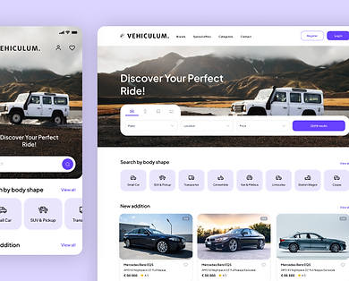
Vehiculum
Design System
Vehiculum GmbH
(Automobile platform)
Background
Role: Senior UX Designer
Company: Vehiculum GmbH
Team: 2 Junior Designers, 1 Tech Lead, 1 Developer Scope: Build a scalable design system for a trust-centric used car selling platform in Germany.
Vehiculum set out to build a used car selling platform for the German market. The challenge was twofold: build user trust in a skeptical market and deliver quickly with limited resources. A design system was the best way forward, but the bigger hurdle was convincing stakeholders it would accelerate, not delay, product delivery.


Task
As the Senior UX Designer, my responsibilities were to:
-
Lead the design system initiative and secure stakeholder buy-in.
-
Define principles, tokens, and components as a single source of truth.
-
Ensure scalability across web, web app, and native apps.
-
Improve collaboration between design and development while reducing inconsistencies.

Actions

Convincing Stakeholders
-
We demonstrated that a lean, adaptive approach would not slow delivery. By adopting Mantine for components, Tabler Icons for iconography, and Tailwind CSS for layouts, we showed how we could move quickly while still ensuring consistency and accessibility. This alignment with business priorities secured approval.

Defining the System & Principles
We started with the product’s core purpose: make it simple and intuitive for users to find their desired car. From this, we defined three guiding principles:
-
Consistency: Cohesive UI and interactions across the product.
-
Efficiency: Speed up design and development, reduce duplication.
-
Adaptability: Scale easily as features grow without overcomplicating the journey.


Building Blocks
We established design tokens as the foundation:
Colors: Primary brand color purple (#6741FF), tokenized for flexibility.
Typography: Plus Jakarta Sans for readability and accessibility.
Icons: Tabler Icons for clarity and scalability.
Layout & Grid: Tailwind CSS for responsive, consistent structure.
Tokens created a shared language between design and development.


Components
We customized Mantine with our tokens to build out accessible, reusable components quickly, avoiding the overhead of building from scratch.

Accessibility
Accessibility was baked in from the start with WCAG-compliant color contrast, legible typography, and inclusive patterns, ensuring the platform worked for all users.


Adoption & Tech Integration
-
Held workshops to onboard the team and align processes.
-
Documented everything in Confluence, including Do’s and Don’ts.
-
Used Figma with Tokens Studio to manage design tokens, exported with Style Dictionary for developers.
-
Showcased components in Storybook, bridging design and dev.
-
Versioned updates in GitHub for transparency.
-
Exported tokens for iOS (Swift), Android (Kotlin), and React Native, enabling future expansion to native and tablet apps.


Results
-
30% faster component development, freeing developers to focus on features.
-
90% fewer inconsistencies in typography and color.
-
30% fewer revisions due to shared guidelines and language.
-
A scalable foundation supporting web, app, and future native platforms.
However, the design system was never fully executed, as the project was shelved due to company-wide layoffs.

Learnings
Principles anchor decisions: Consistency, efficiency, adaptability kept us aligned.
Start lean: Begin with tokens, then scale into components.
Business framing matters: Stakeholders buy into speed, cost savings, and brand impact.
Accessibility is non-negotiable: It builds usability and trust.
A system is living: Success is in ongoing maintenance and evolution.

Thanks for making it all the way!


bottom of page