Naukri : Job Search iOS Registration
Infoedge India Ltd
(Job search platform)
Background
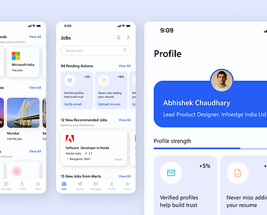
Naukri.com is India’s largest job portal, connecting over 75 million job seekers with 500,000+ recruiters. It helps users across experience levels find jobs, build resumes, and access career tools, all in one place.

Despite its strong brand and massive user base, the iOS mobile registration flow was under performing. Users had to fill out a long, rigid form before they could access anything, contact info, education, work history, skills all upfront. Conversion rates were poor. Most users dropped off halfway.
We discovered this wasn’t just friction it was a wall. Out of 200K+ users who started the process, only 46K completed it. That’s nearly an 80% drop-off rate.


Task
Redesign the job seeker registration flow on mobile (iOS) with the goal of:
Reducing drop-offs
Improving conversion
Enhancing the onboarding experience without sacrificing key data needed for personalization
We had to balance user convenience with business goals: getting profiles recruiter-ready with at least 60% completion.


Actions
Evaluate & Define
-
Heuristic review and user interviews showed high friction in the existing form.
-
Users were frustrated with irrelevant fields and the long upfront effort.
-
Key insight: Users wanted to register quickly and finish later.

Key Personas
-
Freshers: Wanted a fast track; education-focused.
-
Experienced: Preferred uploading resumes and skipping repetitive details.

Core Ideas & Flow Redesign
-
Progressive Disclosure: Ask for only essentials upfront.
-
User Type Branching: Fresher vs Experienced paths.
-
Skip Option: Let users access dashboard without full registration.
-
Microcopy & Tone: More human, less transactional.

Form Design & Microinteractions
-
Clean, single-field focus per screen to reduce overwhelm.
-
Added inline validations, helpful tooltips, haptics, and animations.
-
Built dynamic flows and tested prototypes with real users.


Results
Registration Completion Rate increased by:
+15.08%

Drop-off Reduction
-
Contact Details Drop-off: -8.4%
-
Professional Details Drop-off: -10.6%
-
Education Details Drop-off: -18.9%
User Sentiment:
-
Users found the process simpler, quicker, and more relevant to their goals
-
The skip-to-dashboard option was widely appreciated users felt in control


Learnings
-
One-size-fits-all registration doesn’t work, personalization must begin at onboarding
-
Letting users explore before committing builds trust and engagement
-
Form design and micro-interactions significantly impact completion rates and user perception of effort
-
Microcopy and tone matter. Even subtle changes to language improved experience
-
Stakeholder buy-in was crucial, used research and prototypes to align them with the vision
-
Success isn't just conversion, it’s about reducing frustration and empowering users
Before & After
Steps
Old funnel
New funnel
Start
Flow
Completion
Exit option
Long static form for everyone
Same path for all
Mandatory upfront
None
Minimal info upfront
Tailored by user type
Gradual, progressive
Dashboard access + skip
Thanks for making it all the way!